Grid Tidbits part 2: terminology and basics
This post goes through the terminology of CSS Grid Layout, the basics of defining grid templates, and placing items on the grid.
For this ”tidbit”, we're going to do the following:
- Take an element and convert it to a grid.
- Watch items place themselves onto the grid
- Start playing with how to control the placement.
To play along with the examples in this post, I recommend that you download and fire up Google Chrome Canary, since that browser has the most up-to-date implementation.
Grid terminology
Grid layout works by ”slicing” an element – called a grid container – into rows and columns. The direct child elements of the container element – the grid items – can then be placed on that grid. Grid items can occupy a single grid cell, or span several rows or columns. Collectively, any rectangular part of the grid is known as a grid area. As you are creating rows and columns – known collectively as grid tracks – you are also creating grid lines, made up by the edges of the tracks.
We'll start by creating a simple grid and then identify these pieces as we go along. The markup for now is just a container div and three child elements.
<div class="grid-container">
  <div class="grid-item-a">A</div>
  <div class="grid-item-b">B</div>
  <div class="grid-item-c">C</div>
</div>
Some basic styling to give some dimensions and identify the different pieces with colors:
.grid-container {
  background-color: #E6CAD6;
}
[class^="grid-item"] {
  border: 1px solid #fff;
  font-size: 4em;
  min-height: 2.5em;
  line-height: 2.5em;
  text-align: center;
  color: #fff;
}
.grid-item-a {
  background-color: #3D74C7;
}
.grid-item-b {
  background-color: #85CAAA;
}
.grid-item-c {
  background-color: #DAB97D;
}
Now, what happens if we tell the .grid-container element to display as a grid, and just leave it at that?
.grid-container {
  display: grid;
}
The only thing that seems to happen from a visual point of view is that the width of the four items shrinks down to the content-size of the items themselves. But we have actually created a grid, where there's one column and three rows, all of them sized according to content. This is because of something called the implicit grid – we'll talk more about that in later posts.
The grid template
To get further, we need to define how the grid works. Say we wanted two columns of 50% percent each, and two rows that have an auto height, meaning they are only as tall as the tallest content. For this next trick, we need need the assistance of a grid template. The grid template defines the tracks (columns and rows), and in their simplest form we supply them as space separated lists of sizes, in order of appearance.
.grid-container {
  display: grid;
  grid-template-columns: 50% 50%;
  grid-template-rows: auto auto;
}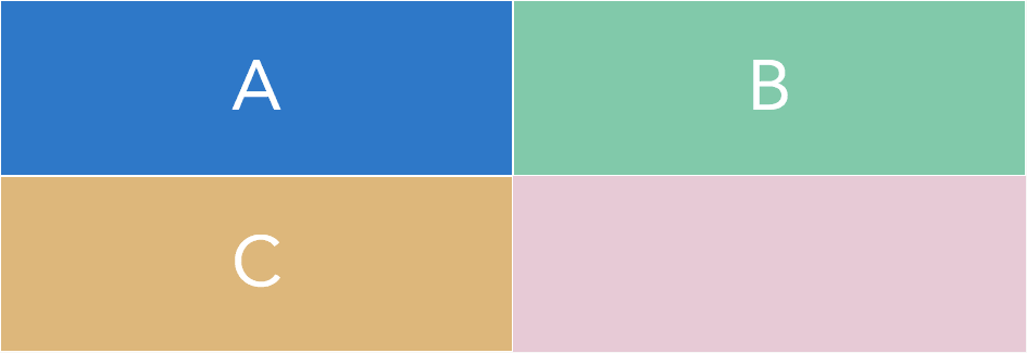
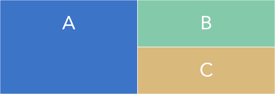
Well, hey now. That is an honest to goodness grid-shaped thingamajig. Our grid items fit neatly into three of the four cells we have defined, and the grid takes up the whole width. Nice. But – we didn't actually place anything yet, and still the items line up column by column, row by row – what's up with that? Well, the grid layout has something called automatic placement and by default it will place each item, going by source order, in the first empty cell of the first row which has an empty cell. So our three child elements will automatically go into three of the empty cells, all by themselves. Neat.
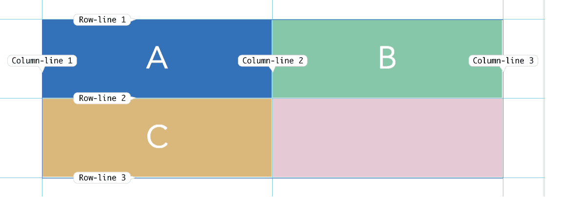
Numbered grid lines
As we created two grid tracks in each dimension, we also created three grid lines in each dimension. For two columns, there's the leftmost line, the middle line and the rightmost line. Similarly, there's top, middle and bottom for rows. These can now be referenced by a number. Grid lines are numbered starting at 1 . (No, not 0. You've been reading too much JavaScript, friend.)
For our left-to-right grid, line 1 is the leftmost column line, and line 3 is the last.
Placing items
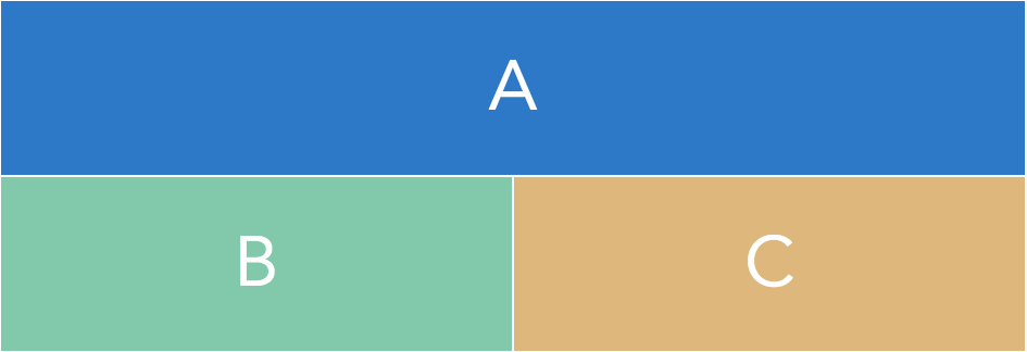
Now for some real meaty stuff: telling items to take up a specific part of the grid. We could, for example, have the .grid-item-a element take up both of the columns in the first row. To do this, we need to supply the lines where it starts and ends.
.grid-item-a {
  grid-row-start: 1;
  grid-row-end: 2;
  grid-column-start: 1;
  grid-column-end: 3;
}
Now, this is a bit verbose. We can use a shorter version by smashing the -start and -end properties together into the grid-row and grid-column properties, separating the start and end indexes by a slash:
.grid-item-a {
  grid-row: 1/2;
  grid-column: 1/3;
}
Well, screw it, let's go for it and smash them into something even shorter. Since what we're actually doing is defining the grid area where the item sits, there is a full shorthand property conveniently named grid-area.
.grid-item-a {
  grid-area: 1/1/2/3;
}
I don't know about you, but I find that kind of hard to read. The order is row-start /column-start / row-end / column-end – so compared to margin or padding shorthands, it's going the opposite way. (As a sidenote, the reason is that it allows you to omit end positions for items that only span one cell).
Negative line numbers and spans
By default, items span one row and one column. As we've already seen, items are automatically placed into the first empty area where they fit, via the automatic placement algorithm. As the .grid-item-a element is first in the source order, we don't really have to specify either of these facts:
- That it sits in the first row
- That it spans one row
Hold that thought for a second.
If we want to reference the grid lines in the opposite direction, we can use negative numbers: the rightmost column line is -1, and the leftmost is -3.
We might have a situation where we are not sure how many columns the final grid will have, but we are sure that .grid-item-a should span all the columns. In that case, the negative line numbering is really handy.
Combining the default placement with the negative indexing gives us a really short way to define the item spanning the whole of the first row.
.grid-item-a {
  grid-column: 1/-1;
}
If we're not interested in spanning the whole row, but more interested in the fact that the element spans a specific number of columns, we can be explicit about that fact instead. Since the starting position is already set by auto placement (first element in source order, starts in column 1, row 1) , we can fall back to only specifying that <code>.grid-item-a</code> spans two columns.
.grid-item-a {
  grid-column: span 2;
}
All of these ways of specifying placement of this particular grid item gives us the same result, but with different levels of readability, and different levels of explicitly placing and sizing the item.
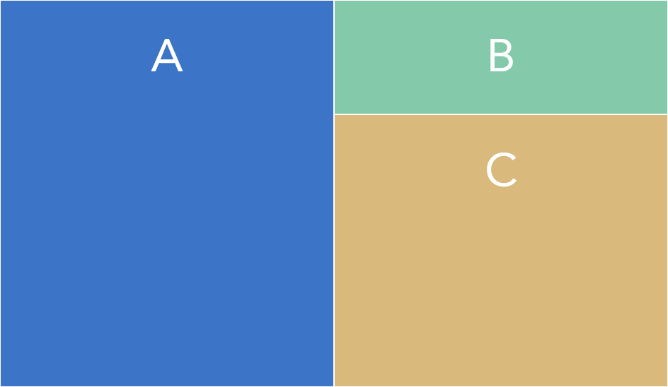
Spanning rows & column height
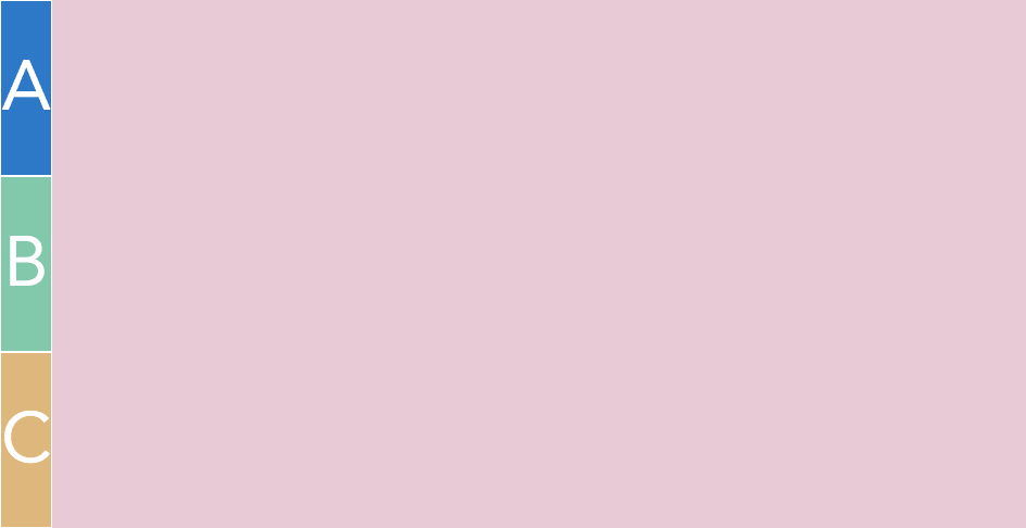
If we switch the “a”-item to span two rows instead of two columns, we can place it as a sidebar of sorts, and the other two items will fill the other two empty slots.
.grid-item-a {
  grid-row: 1/-1;
}
Now, if the “C”-item were to be much taller, the “A”-item would still stretch to take up all of the height of the grid. No more “equal height columns” problems.
.grid-item-c {
  height: 6em;
}
That's all you need to create a basic grid container and placing things inside the grid tracks – rows and columns – you create. In the next installment, we are going to dive into some more advanced parts of defining grids. See you in part three, where we get deep into sizing grid tracks!