Intrinsic sizing of SVG in responsive web design
What follows is a long and rambly exploration of how sizing of SVG content works (or doesn't work) in web pages. Apologies.
Using SVG images in an <img> element in responsive designs will not work the way you think. Well, not if you want cross-browser rendering consistency, anyway, and you expect it to work the same way it does if the source was a PNG or JPEG file.
You might say "well, in that case, let’s use <object>, or just inline <svg>. Well, the worse news is that they’re sort of equally broken in terms of delivering on the expectations I have as a developer.
These expectations basically boil down to this: without styling the element that holds the SVG graphic, it should retain its aspect ratio on the page, and whatever else affects the rendering should be reasonably consistent across browsers.
There are hacks to get around the fact that these expectations are not met, which we’ll get to in the end — skip to that part if you just want to find some solution to consistent SVG sizing.
Warning and apologies: the rest of this article contains a lot of "should", "seems to", "I guess" and "I don’t know". That’s partly because I don’t understand the SVG spec well enough, and partly because it’s incredibly time-consuming to test various different implementations of SVG/HTML (and their attributes) and CSS together. But I hope the conclusions still stand.
Anyway, to start with, here’s a crappy image for you:
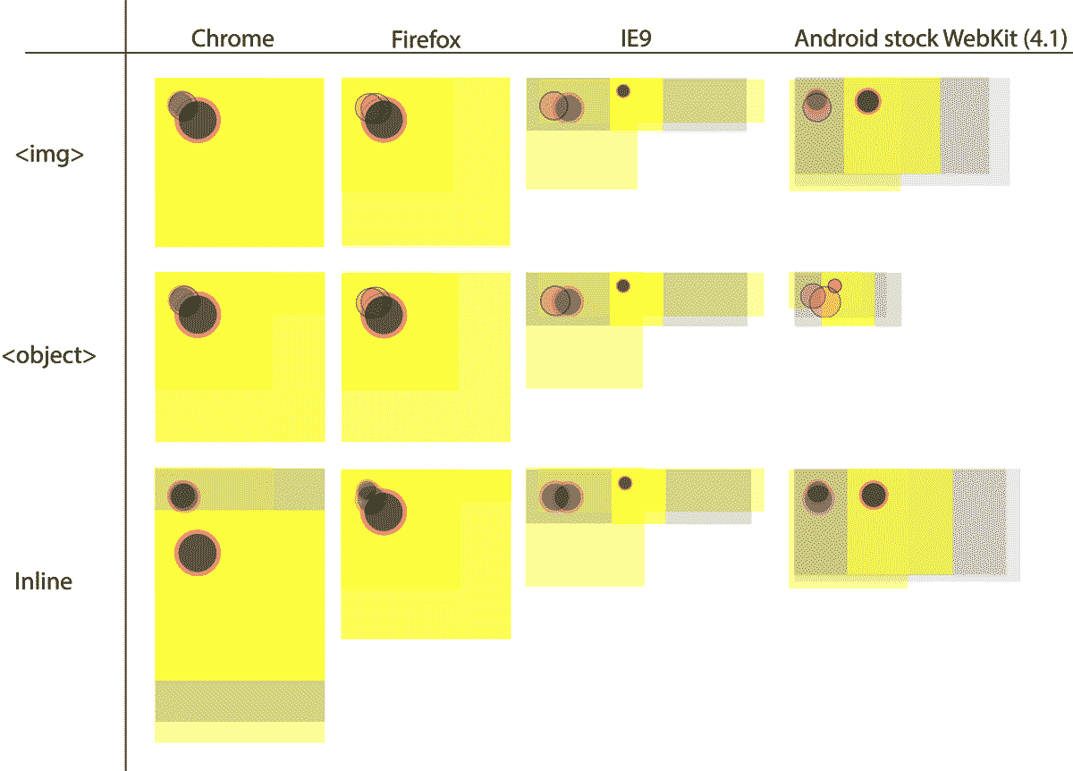
This image shows screenshots of a simple SVG image embedded in a page using <img>, <object> and inline, in latest Chrome, latest Firefox, the stock Android Webkit on a 4.1 version, and IE9. I have not styled them with CSS, only the user-agent stylesheet is applied. This is important: using CSS changes the game, as we’ll see later.
The SVG file looks something like this:
<svg style="background-color: #ccc" xmlns="http://www.w3.org/2000/svg" viewBox="0 0 400 400" width="100%" height="100%">
  <style>
    circle {
        stroke: hotpink;
        stroke-width: 10px;
        fill: #000;
    }
    rect {
        fill: yellow;
    }
    @media screen and (max-width: 600px) {
        circle {
            stroke: #000;
            stroke-width: 5px;
            fill: hotpink;
        }
    }
  </style>
  <rect width="100%" height="100%" x="0" y="0" />
  <circle r="50" cx="100" cy="100" />
</svg>
So we have an SVG element with a style attribute setting a CSS background-color, so we know what’s what on the page.
There’s a yellow rectangle set to take up 100% of the width and height of the current coordinate system, and a circle with a stroke and a fill. For smaller screens, the fill and stroke are reversed, via a @media-query. This is to see if the @media-query triggers based on the measurements of the viewBox, the SVG canvas, or the browser viewport.
In an ideal world, all of the renderings should be consistent, at least in the horizontal rows per type of embedding. They’re not. Not even a little bit. In fact, I haven’t so far found a single combination of values or types of values for the viewBox, width, height properties (as well as preserveAspectRatio, which I’ll leave out in this exploration since I don’t think it’s relevant) that renders consistently for even one of the types in the test above. There are, however, so many variations to test in so many browsers, so I can’t even pretend that this is conclusive.
There seems to be several reasons why this is, and I thought I’d try to document my understanding of them so far.
Viewports in viewports etc.
I’ve tried to read and understand the SVG spec on how the various types of viewport coordinates relate to each other, the width and height attributes, and the final rendered size of the graphic on the page. Basically, there’s two sets of coordinate systems: the measurements and coordinates for the rendered SVG canvas as seen in the page, and the ones that decide the viewBox, meaning the part of the SVG that is visible on this canvas. I tried to grok this, and I willingly admit that I failed. It seems I’m not alone: the SVG Working group and the browser makers seem to have trouble with this as well.
I can’t even try to boil down how the spec explains exactly what gives (or doesn’t give) the SVG it’s intrinsic width and height in these various cases, but therein lies the rub: the browser makers seem to all interpret it differently.
Two things tend to happen when the browser does unexpected things with the size and aspect ratio of an SVG graphic: either it renders too tall and/or with what appears as whitespace around it, or it collapses down to something small that is often 300px × 150px, or one of these measurements.
Why is the rendered SVG sometimes very small?
In some user-agents, when they fail to calculate a size for the element they fall back to a default size for replaced elements of 300px width × 150px height. That size is from deep within a dark corner of the CSS 2.1 spec, so I guess that’s somewhat reasonable. Mostly it seems to happen when the viewBox attribute values are set in pixels instead of unitless.
What about media queries, those are consistent, right?
Well, it seems that these differ as well. For example, the Android WebKit browser I tested did apply the media query even if the viewport was over 600px, if an SVG file via <object> element was missing the width and height attributes, something that all others did not.
Why is rendered SVG sometimes very big, or with unreasonable whitespace around it?
Some browsers seem to map the value from the width and height properties to width and height in CSS, and since the default (and probably most sensible setting) for those values is 100%, the element ends up being 100% wide and as tall as the viewport. Or perhaps its containing block. Who knows. If you use a viewBox attribute, a viewport inside the SVG canvas is defined, and the coordinates inside the SVG element are set in relation to this. The SVG canvas will still be 100% tall and 100% wide in many cases, so if you have a background on stuff inside of the SVG but no background on the actual element itself, there will appear to be "whitespace" around the contents.
Now, what happens if you set the width and height in pixels? Well, as long as the element (<img>, <object> or <svg>) fits in its container, things look better. Fine actually. But the graphic won’t scale in a responsive design unless you start messing with it in CSS to override the width, and then things start falling apart again. See the part on fixing this further down.
Why is the content sometimes "sticking out" of an inline SVG file on IE?
IE does the "collapse to 150px height" trick quite a bit when you don’t include enough data about sizes in the SVG: it can apparently figure out a 100% width quite often though. Interestingly enough, it can still position stuff in the correct place in relation to the coordinate system in the SVG, and since the default stylesheet in IE lacks the svg:not(:root) { overflow: hidden; } ruleset that the spec recommends, stuff ends up overlapping other stuff in the page when the SVG is inline. That’s why that particular ruleset appears in Normalize.css, I guess.
Can we use CSS to fix these issues?
Yes and no.
For the <img> element, we can fix this, using an explicit width—something like width: 100%;—note that max-width will not help us there. When you apply a width, the image from SVG can behave consistently across browsers, with the correct aspect ratio. The prerequisite seems to be that you ditch the viewBox attribute and set width and height to measurements that define the desired aspect ratio (and coordinate system) for your image.
Fixed width is not enough for the other methods.
Setting a fixed measurement for the height and width attributes (e.g. not 100%) for <object> or inline <svg> elements changes the rendering get them to render consistently as long as there is space enough (i.e. if you set the width to 400px and height to 400px, the containing block needs to be at least that big).
If it’s not, different browsers might handle the contents in different ways: most will shrink the content when the area gets narrower but keep the explicitly declared height (even if you set height to auto in CSS), making the SVG canvas stay 400px tall but the content shrinks proportionally inside it.
Intrinsic ratio container trick
The best way to fix the inconsistencies that I’ve encountered is to use the intrinsic ratio trick pioneered by Thierry Koblentz in his A List Apart article.
It boils down to that you have to know the aspect ratio of the graphic you want to show, and you wrap it with a container element (like a <div>) and give that element a height of 0 and a padding-bottom in percent that represents the aspect ratio. You then give the <svg> or <object> element a width and height of 100% and position it absolutely inside the wrapper. All done: it should now render nice & consistently.
Finishing thoughts
So, why am I rambling about all this? A couple of reasons. First, I wanted to write it down for my own sake: both to be able to look it up when I need to, and because writing stuff down helps you think.
Second, I really hope that someone will say "You idiot, you’re doing it wrong, you just have to do X", and all this will go away. That would be awesome, and I freely admit I’m in the beginning of my SVG journey.
Third, others seem to be asking the same questions all over the place (Stack Overflow and elsewhere), so maybe having it all here in one place helps someone.
Finally, my wishlist for the future is that browser makers get coordinated about how this stuff works. In general, Firefox seems to behave in the most intuitive way as far as I can tell, and I hope others fall in line.
It’s not a huge deal having to hack your way around these inconsistencies, but it’s kind of worrying that you have to either set an explicit width or know the intrinsic ratio of a graphic if you want to place it in your page with some degree of cross-browser consistency. In many situations (images uploaded by users in a CMS comes to mind) you just don’t have that information at hand while designing.
Send me a line if you, dear reader, have any feedback on this stuff.